Taylor Brothers and Ginger Storm – a Case Study
Ginger Storm came to Taylor Brothers all the way from South Africa to help bring to life their fabulous designs for a suite of ultra premium stationery and brochures for Stratum.
PROJECT OVERVIEW
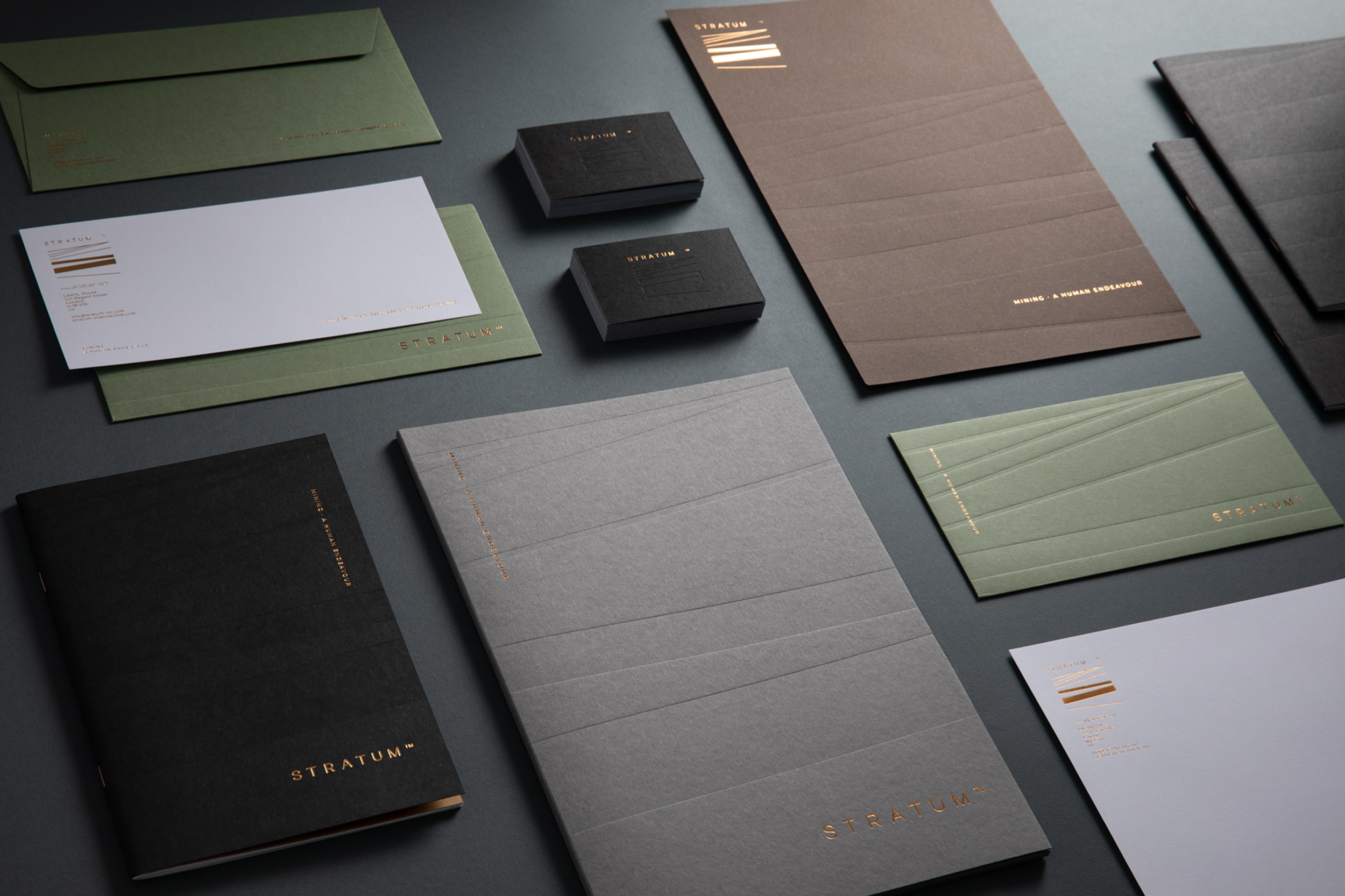
Stratum provide bespoke human capital solutions to the mining industry and have a unique approach that focuses on the ‘human element’ of mining. The company needed a brand identity and stationery that positioned them as the premium executive search, recruitment, and management consulting firm.
The stationery needed to communicate the status and service delivery of the company with an emphasis on broad appeal from top-tier individuals and companies to the miners. This provided the challenge of needing to be premium and exclusive, without isolating the mining managers on site.
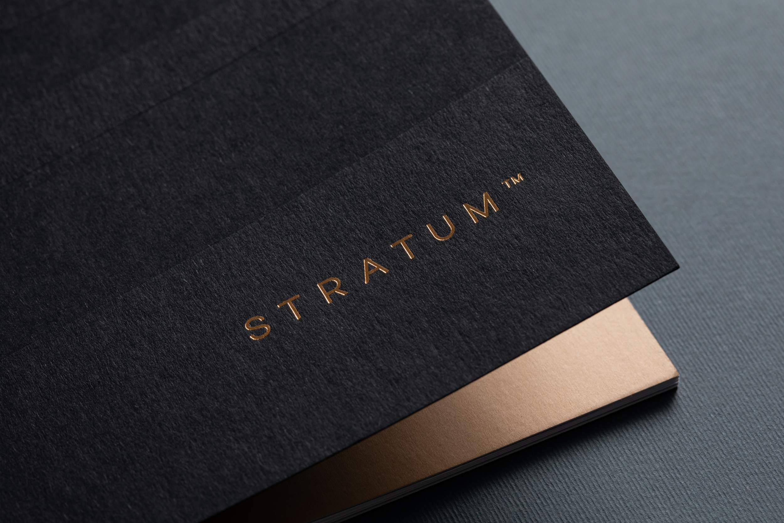
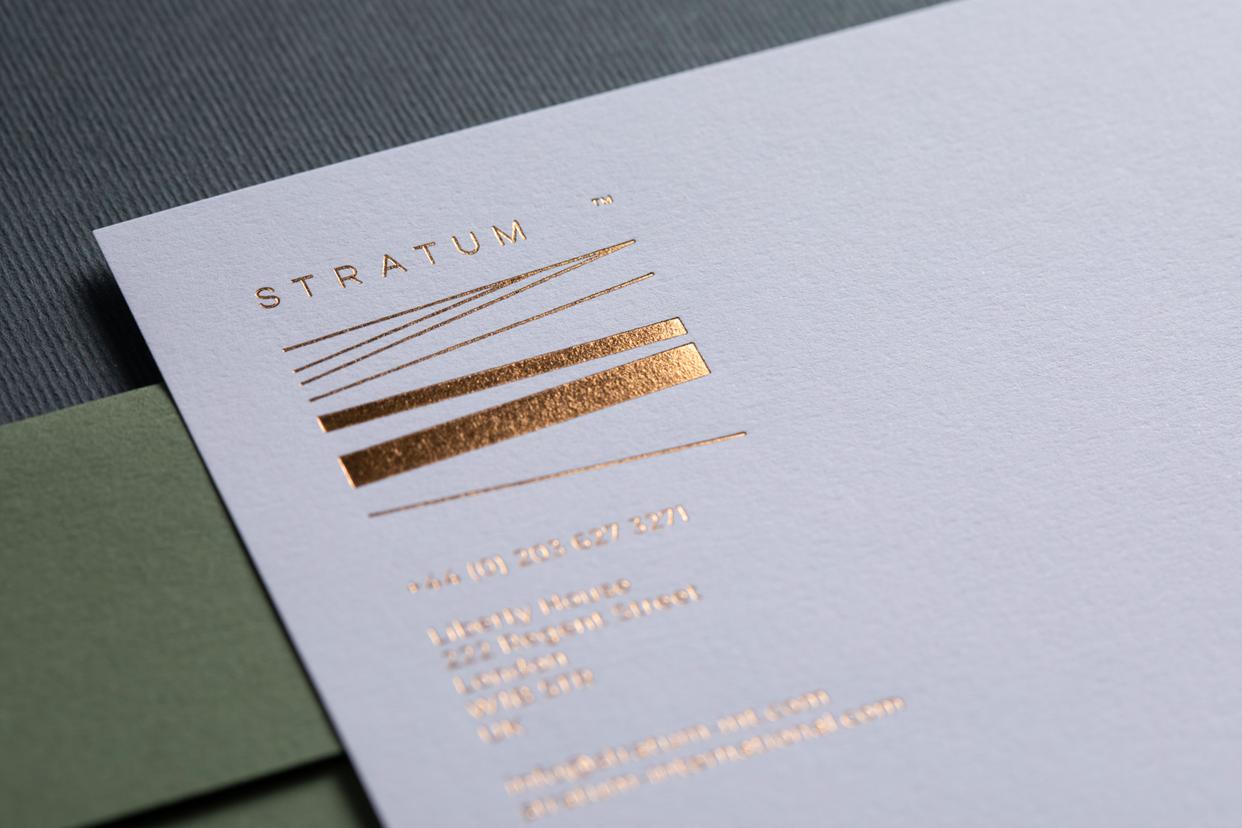
Ginger Storm designed a contemporary logo that’s a symbolic representation of the layers of stratum in the earth. The attention to detail in every item of stationery, produced on the finest GF Smith materials, combined with elegant and modern typography with bronze foiling, gives the brand a premium feel. The use of foils also acts as a nod to the mining industry and highlights the warm colours of the earth. The graphic element of the stratum is used across all stationery items and is debossed to add tactility. A diverse, earthy colour palette alongside premium cotton paper, and the foiling, results in an elegant stationery combination across various executions.
Hand-printed stationery is sadly a thing of the past, and not as prevalent in a digital world. However, we still have an incredibly nostalgic attachment to it, and it demonstrates, not only a high-end industry that hasn’t cut corners but an intense commitment to personalised communication.